When I hear Joe the Plumber complaining about the 39% tax bracket, I get confused. When I hear normally thoughtful people waxing nonsense about the relative poverty, that it is no big deal in the USA, I get irritated. When I hear Fox presenters being envious about those individuals who do not pay taxes – I get sort of mad.
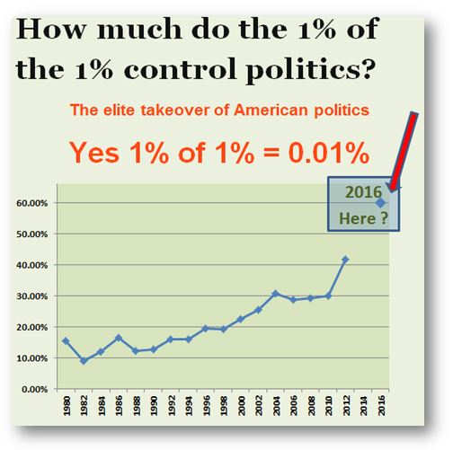
If ever I lose my bearings – I simply refer to the below. This chart I pin to my office wall. I look at this chart at least once a month. If you hear a statistic that tells you that 40% of Americans either live in poverty or are one crisis away from poverty – and doubt the validity, just study the implications of this chart. When the whole central pillar of SP tax policy is to terrify the population regarding the merely delayed implementation of the SP tax policy of the 39.6% tax bracket for those earning $400,000 -$450,000 – which really means over $500,000 (do I have to explain?) – well just look at this (2011) chart to put all those fears into perspective.


